Frederick's Ice Cream
Project Overview
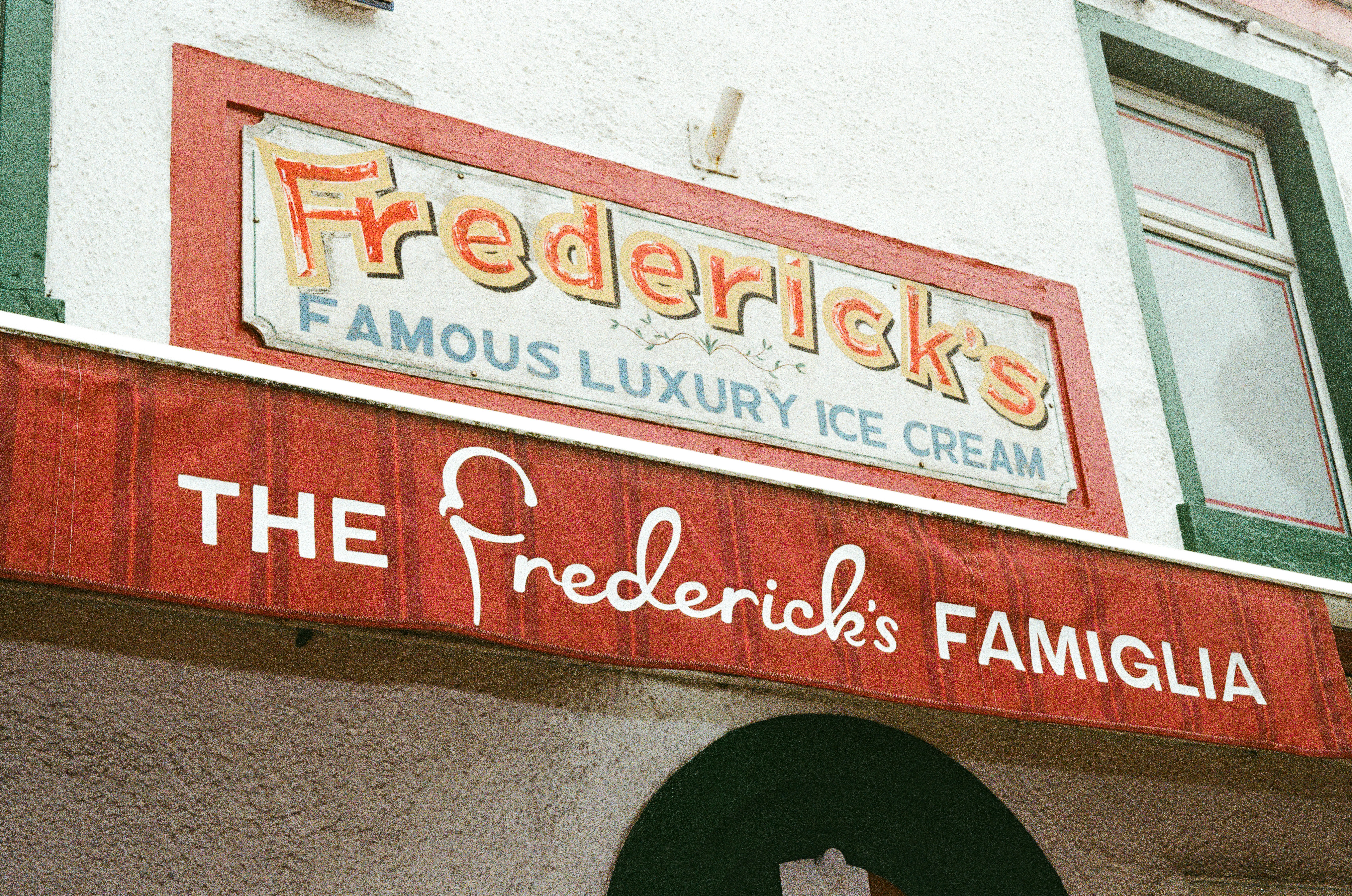
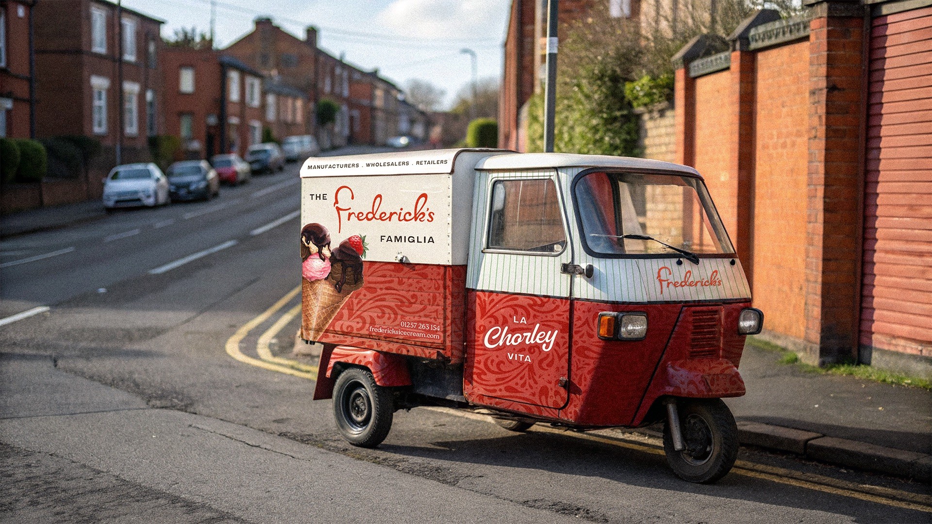
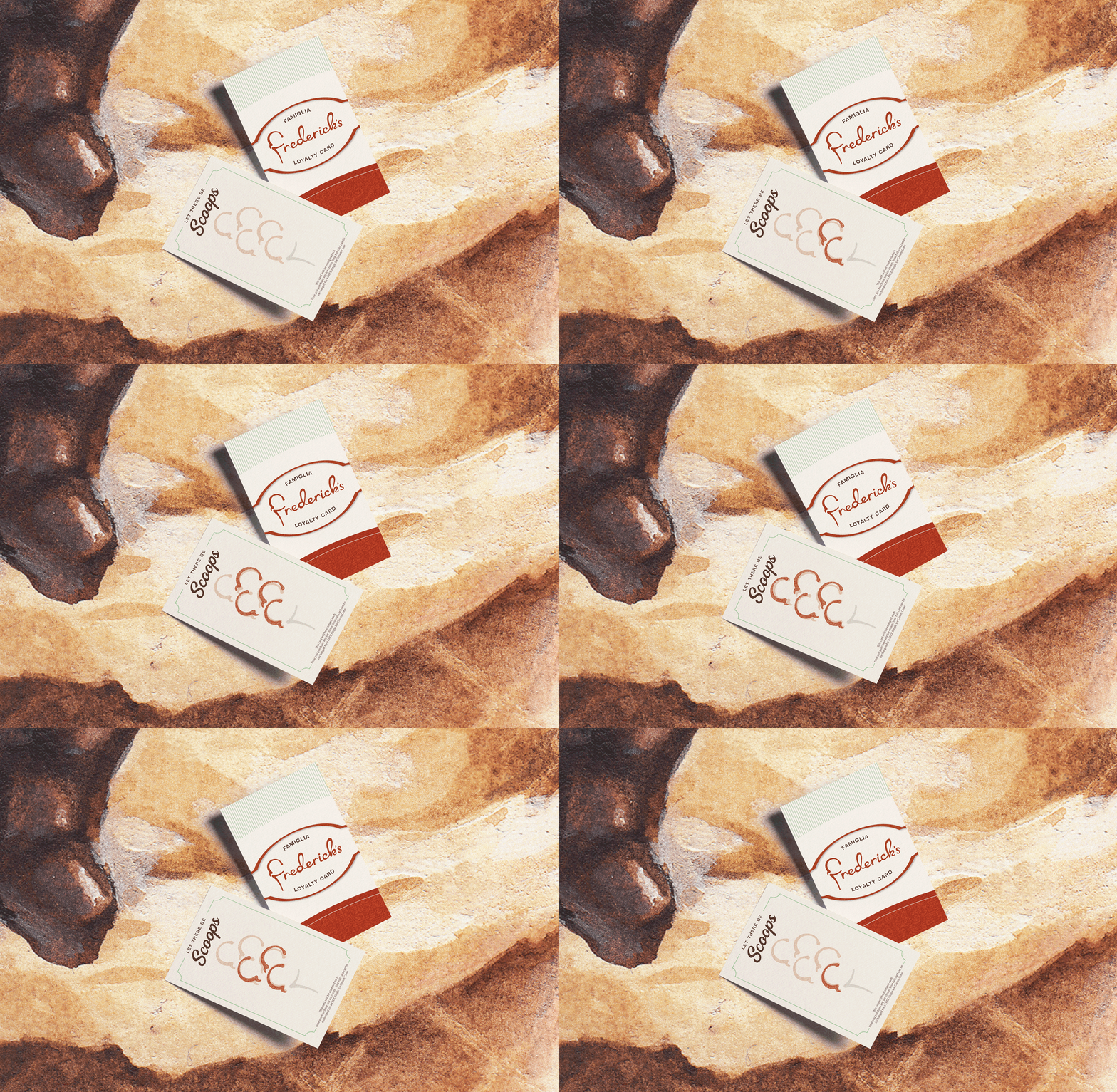
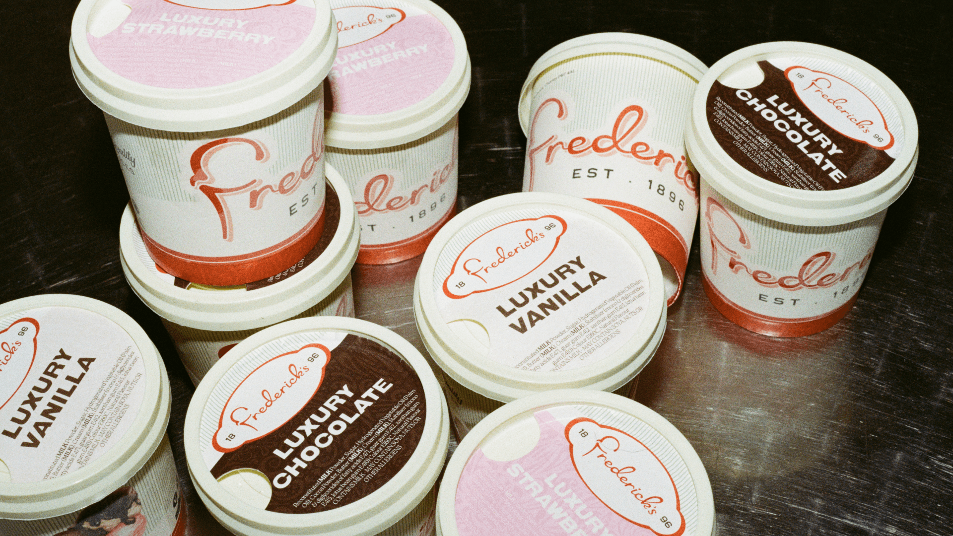
In 1896, a classic romantic tale unfolded. Two Italian lovers, bound by craft and quality, travelled across borders and traditions before their paths finally crossed...in Chorley. Since then, Frederick’s Ice Cream has been a cornerstone of the community, blending blissful Italian leisure with true northern charm. We call this La Chorley Vita. The identity honors this legacy through a timeless brand built to last.
Project Type
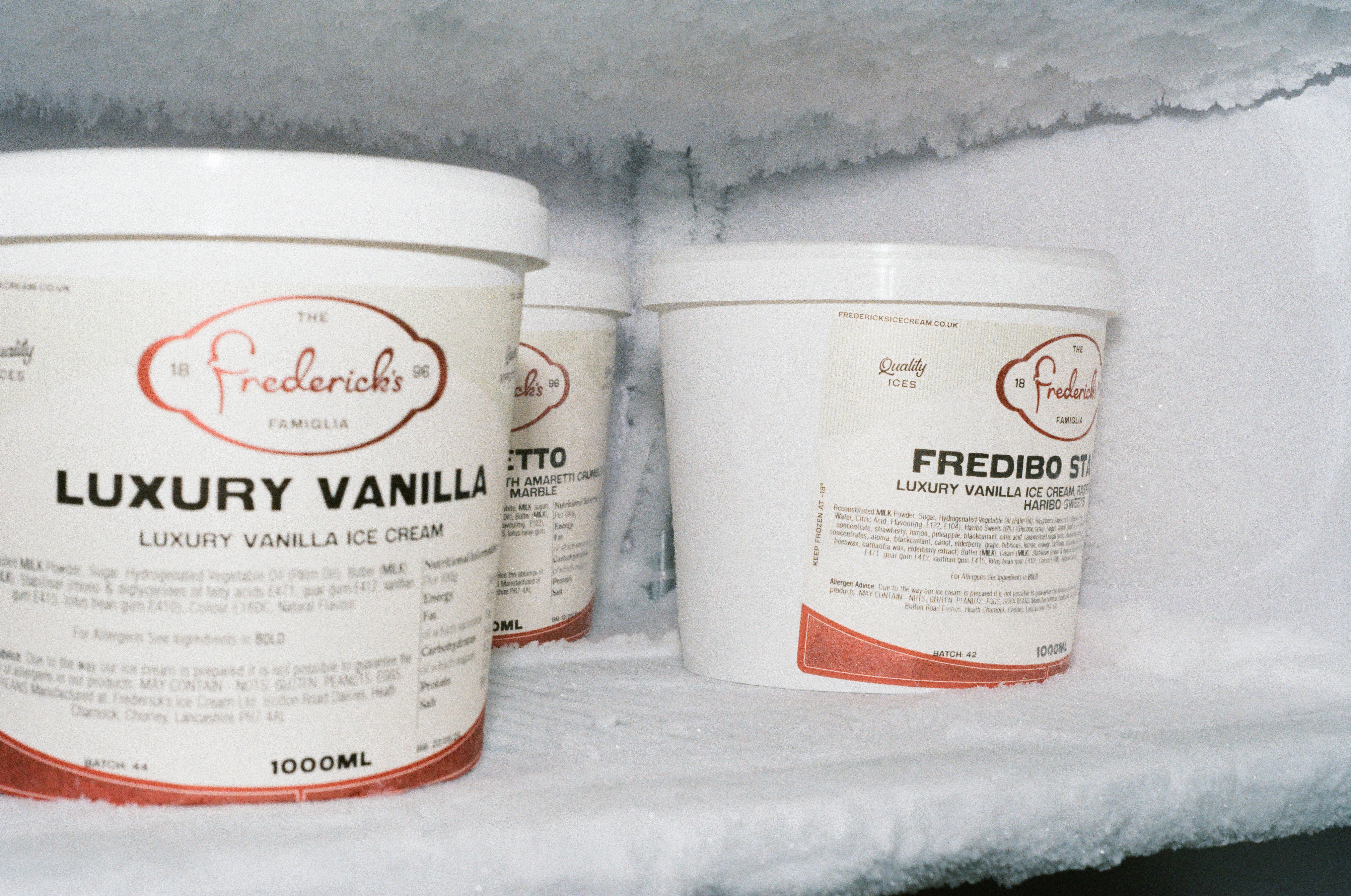
Brand Identity & Packaging Design
Year
2024
My Role
Lead Brand Designer
Client
Frederick's Ice Cream